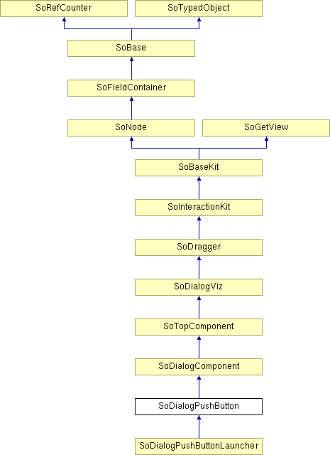
SoDialogPushButton Class Reference
[Dialog]
 Dialog push button node.
More...
#include <DialogViz/dialog/SoDialogPushButton.h>

Public Member Functions | |
| SoDialogPushButton () | |
| void | addAuditor (SoDialogPushButtonAuditor *auditor) |
| void | removeAuditor (SoDialogPushButtonAuditor *auditor) |
Public Attributes | |
| SoSFString | buttonLabel |
Detailed Description
 Dialog push button node.
This node defines a push button component for the dialog. This node is composed of a label on the left and a push button on the right. By default the text of the label (label) and the text of the button (buttonLabel) are empty strings.
A 2D SoDialogPushButton component looks like:

To add or remove an SoDialogPushButtonAuditor, use the addAuditor() and removeAuditor() methods. The push button auditor happens when the mouse left button is up, or the <SPACE> key is released.
You can change the parts in any instance of this button using setPart(). The default part geometries are defined as resources for this SoDialogPushButton class. They are detailed below in the Catalog Parts section of the online reference page for this class. You can make your program use different default resources for the parts by copying the file $OIVHOME/data/DialogViz/Skins/default/DialogPushButton.iv into your own directory, editing the file, and then setting the environment variable DIALOGVIZ_SKINS_DIR to be a path to that directory, or by using the setSkinDirectory() method in your application.
FILE FORMAT/DEFAULT
- DialogPushButton {
| buttonLabel | "" |
| // fields from SoDialogComponent | |
| width | 0 |
| height | 0 |
| fixedWidth | FALSE |
| fixedHeight | FALSE |
| minWidth | 0 |
| maxWidth | 0 |
| minHeight | 0 |
| maxHeight | 0 |
| margin | 0 |
| edgeStyle | NONE |
| labelVisibility | TRUE |
| // fields from SoDialogViz | |
| enable | TRUE |
| label | "" |
| labelAlignment | RIGHT |
| auditorID | "" |
CATALOG PARTS
-
SoDialogPushButton {
Switch edgeStyleSwitch (from SoDialogComponent) {
Specify the appearance of the component border. By default, the component has its edgeStyle set to NONE.
Group edgeStyleNone (from SoDialogComponent)
Defines the appearance of the component when edgeStyle field is set to NONE.
Group edgeStyleShadowIn (from SoDialogComponent)
Defines the appearance of the component when edgeStyle field is set to SHADOW_IN.
Group edgeStyleShadowOut (from SoDialogComponent)
Defines the appearance of the component when edgeStyle field is set to SHADOW_OUT.
}
Group labelProp
Specifies properties to apply to the text node that represents the label field value.
Switch frameSwitch {
Defines the traversed geometry relatively to user action.
Group released
Defines the geometry of the push button when the button is its released state.
Group pressed
Defines the geometry of the push button when the button is activated be the user.
}
Group buttonLabelProp
Specifies properties to apply to the text node that represents the buttonLabel field value.
}
Extra information for parts from above structure
USAGE
Tab: Go to the next control in the current SoTopLevelDialog.
<SHIFT> + Tab: Go to the previous control in the current SoTopLevelDialog.
<SPACE>: If the window has focus, space bar activates the push button.
SEE ALSO
SoDialogCheckBox, SoDialogCheckBoxLauncher, SoDialogComboBox, SoDialogRadioButtons, SoDialogCustom, SoDialogEditText, SoColumnDialog, SoRowDialog, SoTabDialog, SoDialogLabel, SoDialogPushButtonLauncher, SoDialogSeparator, SoDialogIntegerSlider, SoDialogRealSlider
- See related examples:
Constructor & Destructor Documentation
| SoDialogPushButton::SoDialogPushButton | ( | ) |
Constructor.
Member Function Documentation
| void SoDialogPushButton::addAuditor | ( | SoDialogPushButtonAuditor * | auditor | ) |
Adds a dialogPushButtonAuditor to the current PushButton component.
| void SoDialogPushButton::removeAuditor | ( | SoDialogPushButtonAuditor * | auditor | ) |
Removes the specified pushButtonAuditor from the auditor list.
Member Data Documentation
Specifies the label of the button.
Default is empty string.
The documentation for this class was generated from the following file:
- DialogViz/dialog/SoDialogPushButton.h