|
Open Inventor Release 2024.2.3
|
|

| |
|
Open Inventor Release 2024.2.3
|
|
|
| |
DialogViz provides a set of basic components that you are already used to using in a graphical user interface.
DialogViz puts the following classes at your disposal: (the indentation shows class derivation).

Build an SoMenuCheckBox component, but having a specific behavior when activated. This component can have SoTopLevelDialog children.
Build a submenu item in a menu structure. This component can have SoMenuItem children.

Build a trigger button menu item.

Build a trigger button which when activated launches a file selection dialog box.
Build an SoMenuPushButton component, but having a specific behavior when activated. This component can have SoTopLevelDialog children.
Build a list of selectable items in a menu structure.

Build a separator item in a menu structure.
 Figure 29.2. SoMenuItem abstract class
Is an abstract class defining common properties for dialog components,
like width, height, edgeStyle,...
- SoDialogCheckBox
Build a true/false button.

* SoDialogCheckBoxLauncher
Build a true/false button. Has a specific launching behavior when
activated. This node can have **SoTopLevelDialog**
children.
- SoDialogChoice
Is an abstract class for all components providing a choice between
several items.
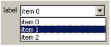
* SoDialogComboBox
Build a roll out list. This is a “Select one”
list.
* SoDialogRadioButtons
Build a “select one” button list.

- SoDialogCustom
Build a custom component where any type of widget can be mapped, for example, an Open Inventor viewer.
- SoDialogEditText
Build a user input/reading zone.

- **SoDialogGroup**
Is an abstract class for all organizer components. These components can
have children of type **SoDialogComponent**.
* SoColumnDialog
Manages children organization by column.
| | | |
| --- | --- | --- |
| SoDC 1 | SoDC 2 | SoDC 3 |
* SoRowDialog
Manages children organization by row.
| |
| --- |
| SoDC 1 |
| SoDC 2 |
| SoDC 3 |
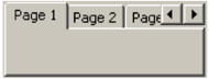
* SoTabDialog
Manages children organization by pages.
- SoDialogLabel
Build a simple label.
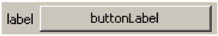
- SoDialogPushButton
Build a trigger button.
* SoDialogPushButtonLauncher
Build a trigger button having a special behavior.
- SoDialogSeparator
Build a vertical/horizontal separator line (depending on parent node).

- **SoDialogSlider**
Is an abstract class for sliders.
* SoDialogIntegerSlider
Build a slider with integer values.
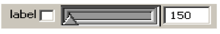
* SoDialogRealSlider
Build a slider with real values.
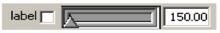
Figure 29.3. SoTopComponent class
Nodes with a grouping behavior are the SoTopLevelDialog, SoMenuBar, and SoMenuPopup nodes, and the SoDialogGroup -derived classes SoColumnDialog, SoRowDialog, and SoTabDialog. (The launcher classes are explained next). These different containers can be used together to create a well-organized interface.
To add a child to these classes, simply use the addChild() method similar to an SoGroup node. All other SoGroup methods like insertChild(), replaceChild(), ..., are available as well.
 Careful, although these classes have similar methods, they do not
inherit from the SoGroup class.
Each one of these nodes manages its own children. Container nodes can be nested to create more complex groupings.
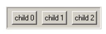
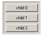 SoRowDialog manages the position of its children to make rows: it puts one child beneath the other. When resizing, the SoRowDialog component resizes all its children according to the constraints on them. The size difference between the initial and final size is evenly distributed.
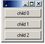
 SoColumnDialog manages the position of its children to make columns: the children are placed side by side.
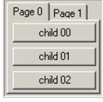 SoTabDialog organizes its children by pages. This component can be very useful when there are a large number of controls that would not fit well on a single page.
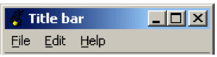
 SoTopLevelDialog has the same managing behavior as SoRowDialog. The difference is that SoTopLevelDialog can have a child (only one) of type SoMenuBar and some other children of type SoDialogComponent. If an SoMenuBar child exists, a menu bar is built at the top of the window. The SoMenuBar can have children of type SoMenuPopup which constitute the sub-menus. The items of the menu will be children of the SoMenuPopup nodes.
Like other extension modules, DialogViz must be explicitly initialized. The method to use is: SoDialogViz::init().
There are two ways to build a graphical interface A complete interface, or any part of any interface, may be read from one or more Inventor format files. An interface, or any part of an interface, may be created programmatically just like any other Open Inventor nodes.
A 2D dialog window is built by using the SoTopLevelDialog::buildDialog() method. The show() method draws the dialog. A 3D dialog is built by adding the DialogViz nodes to a displayed scene graph. See 2D/3D Differences for more details.
The first way to create and use a DialogViz interface is to load it from an Inventor file. Simply use the SoDialogViz::loadFromFile(SbString filename, SbString auditorID) method to load your DialogViz tree.
This method take two arguments:
 Using the auditorID parameter is
convenient when you want to define several dialog boxes in the same Inventor file. For example, to generate the following DialogViz window:

and load it in your application as follows:
C++ :
See 2D/3D Differences for more information about the buildDialog() method.
A DialogViz interface can also be built programmatically, just like you would build an ordinary Open Inventor scene graph.
To create a dialog window,
C++ :
The way to build a 2D and a 3D DialogViz interface is the same, but some rules must be followed for the two cases:
+ The DialogViz structure must start with an **SoTopLevelDialog** node. This node represents a “physical” system window.
+ To build the window, you must call the **SoTopLevelDialog::buildDialog(**) method and then the **show()** method to draw the dialog.In the 2D case, DialogViz builds the user interface on your 2D desktop
using the local native 2D user interface toolkit (e.g., Motif, Windows). The user interface will have the appearance of the native UI toolkit. It will be displayed in separate windows that can be moved around on the desktop.
 SoTopLevelDialog::buildDialog(Widget, SbBool) has two
arguments. The first argument corresponds to the parent window you want for the DialogViz window, and the second argument specifies if the new
window should be mapped inside or outside the parent window.
+ Just add your DialogViz nodes to your Inventor scene graph. In this
 case, DialogViz components can be treated just like ordinary Inventor nodes (because they
 are ordinary Inventor nodes).
+ You can use each component independently.In the 3D case, the user interface components are drawn using Open
Inventor nodes, and are displayed inside the Open Inventor 3D window. You will need to specify an appropriate camera in the scene graph to make sure that that the DialogViz components are positioned in a suitable location relative to the rest of the geometry in the scene. The appearance of the 3D DialogViz components can be customized using skins, described in DialogViz Skins.
An Inventor file can define a DialogViz scene graph which doesn't start with an SoTopLevelDialog component. However, in this case, the file cannot be loaded
to build a 2D interface.
A loaded DialogViz interface can be used in 2D and 3D at the same time. The 2D dialog box structure must start necessarily with an SoTopLevelDialog to be able to be created. However, it’s possible to render in 3D only a part of the loaded DialogViz structure simply by inserting the requested sub-scene graph in your main scene.
In order to customize your 3D interface, DialogViz allows you to redefine the appearance of the 3D components using skins.
Skins only affect the appearance of 3D DialogViz components. The appearance of 2D components depends on your system
appearance settings.
All DialogViz classes are derived from the SoDragger class. So, like draggers, a DialogViz component has some parts you can pick on, and other parts that replace them when they are active or moving. These active parts are often just the same geometry with another color or texture. Each of these pieces has a default scene graph, as well as a special function within the dragger.
Like draggers, you can retrieve a part of any instance by using the getPart() method, and you can set them by using setPart() method.
But draggers also give each part a resource name. When a dragger builds a part, it looks in the global dictionary for the node with that resource name. By adding a new entry in the dictionary, you can override the default. The default part geometries are defined as resources for each class, and can be found in a corresponding file you can change to alter the defaults. The files are listed on each DialogViz component’s reference page. You can make your program use different default resources for the parts by changing the default skins directory located at OIVHOME%/data/DialogViz/Skins/default/ to your own directory. To define your own directory, you can set the environment variable DIALOGVIZ_SKINS_DIR to be a path to that directory, or use the SoDialogViz::setSkinsDirectory() method in your application.
Currently, several skins are provided:
The launcher components have been developed to simplify utilization for programmers. The goal of the launcher is to directly load a new SoTopLevelDialog component when it is activated. This is useful primarily when you want to open other dialog windows in the application that are configuration windows or other special-purpose windows that don’t always need to be visible. The presence of the launcher allows the programmer to avoid having to develop an auditor class (See Interacting with Your Application for more details on creating and using auditors) to handle the activation of a control that would be dedicated to open a new window
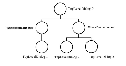 The scene graph above allows the “TopLevelDialog 1” dialog box to be shown by triggering a push button “PushButtonLauncher”. By changing the check box “CheckBoxLauncher” state, the dialog windows “TopLevelDialog 2” and “TopLevelDialog 3” are launched or hidden at the same time.
SoDialogCustom was created to map any widgets you want to see in a dialog window. For example, it’s very interesting to be able to embed an Open Inventor viewer in the same window with the user interface controls.
The next steps show you how to include a viewer in a DialogViz window:
C++ :
This allows you to build an advanced interface that could look like:
 1.9.8
1.9.8